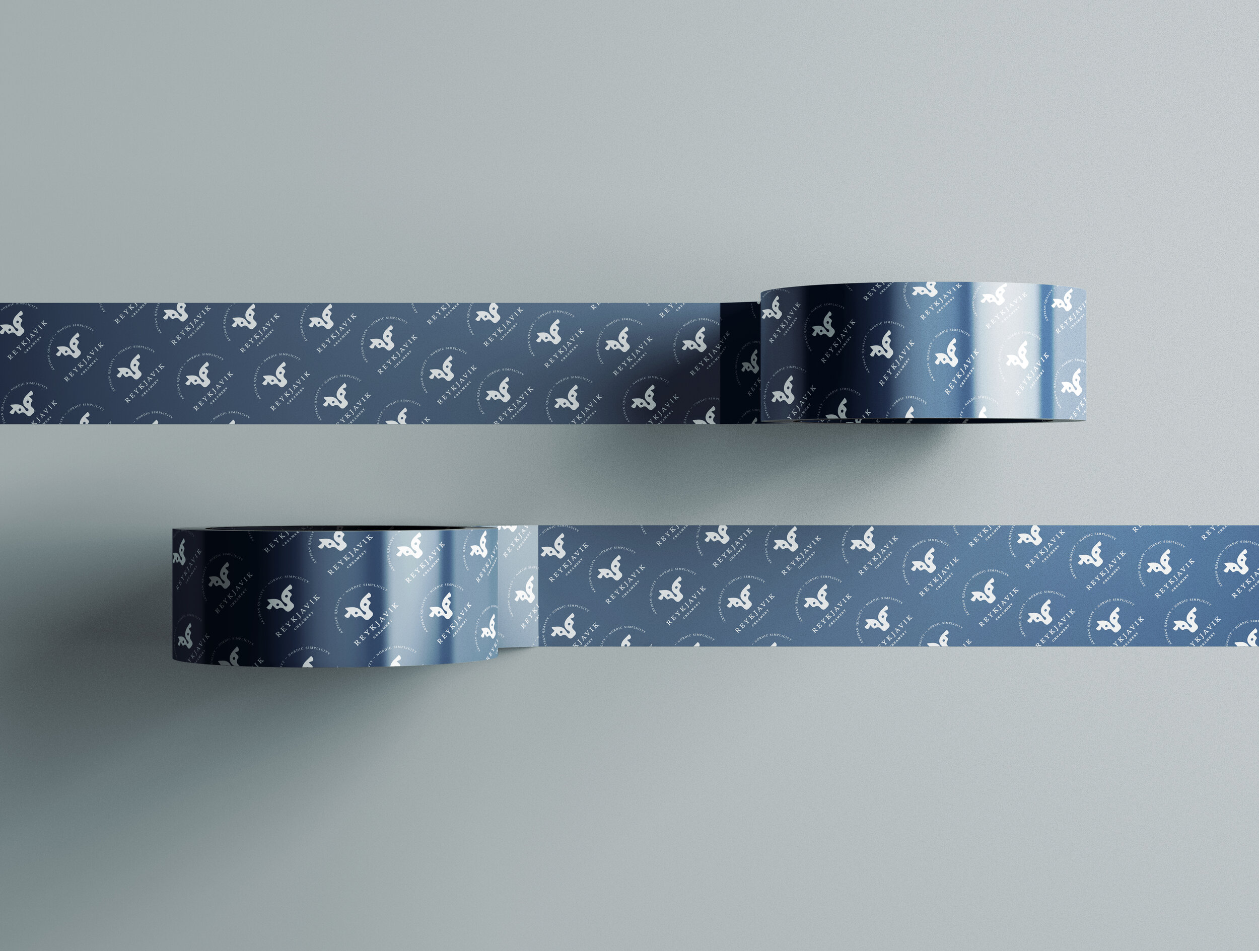
The Logo Process For One Pretty Cool Creamery
– IF YOU LIKE THIS POST, PICK YOUR FAVORITE IMAGE ABOVE & PIN IT TO PINTEREST –
I love it when I get the chance to work with companies with ties to Iceland. Even though I’ve been in the states for over 12 years (and still no actual plans for moving back) I feel very connected to my roots, and cherish every opportunity I have to work with businesses and entrepreneurs back home. Reykjavik Creamery is a startup of a brand new 30,000 square foot plant in Pennsylvania, PA offering cultured dairy products. It produces Icelandic skyr, Greek yogurt & drinkable yogurt with the co-packaging capabilities that offer product manufacturing that range from organic dairy products to products that require ultra filtration processing.
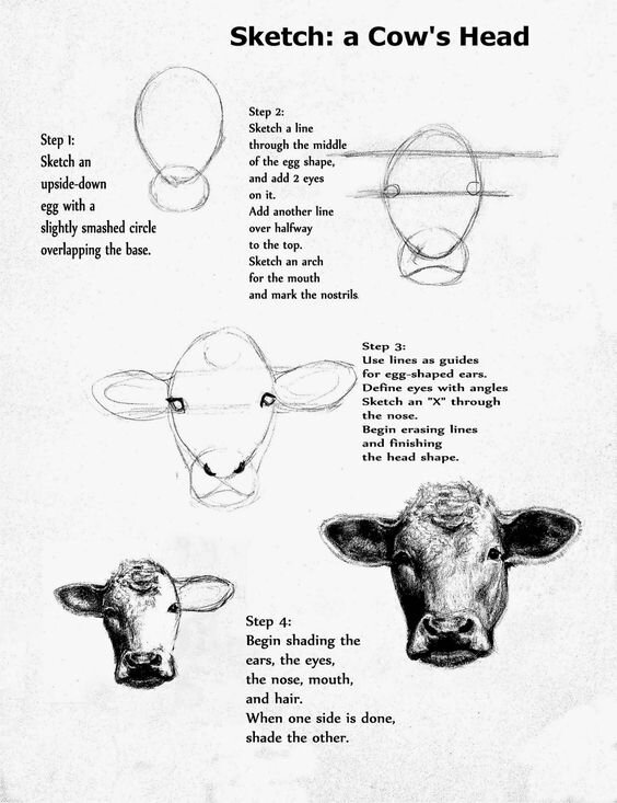
I’ve been lucky enough to be working with them for some time now, though all we have developed together up to this point I am not allowed to show (maybe some day – there are some pretty cool packaging ideas in the mix of all the stuff) but when they reached out to have be develop their logo for headquarters, I felt so privileged to step in. Of course I had worked with this client before, but not in the actual development of a company logo, so I wanted to make sure that we went through all the steps in the process and once we had our initial conversation, I dove into finding things here and there that could inspire the beginning of the process. We knew we wanted an icon, something that was modern but classic and with a connection to home.
Inspiration & sketches
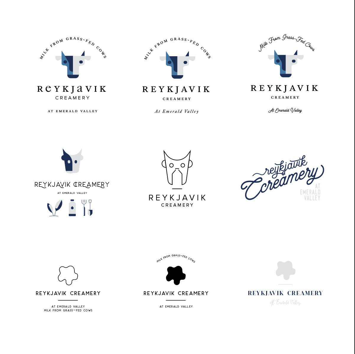
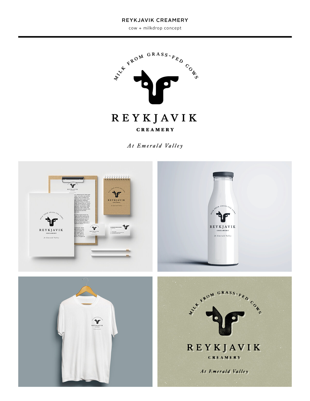
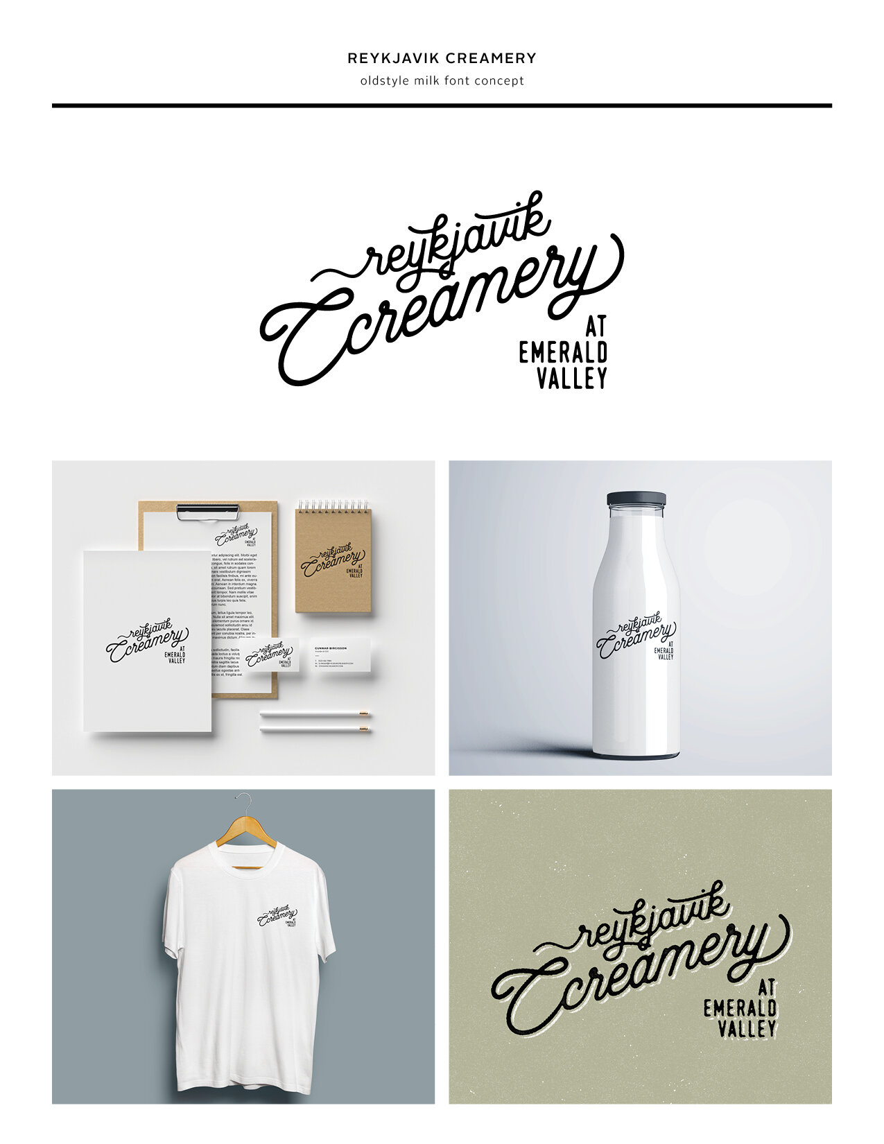
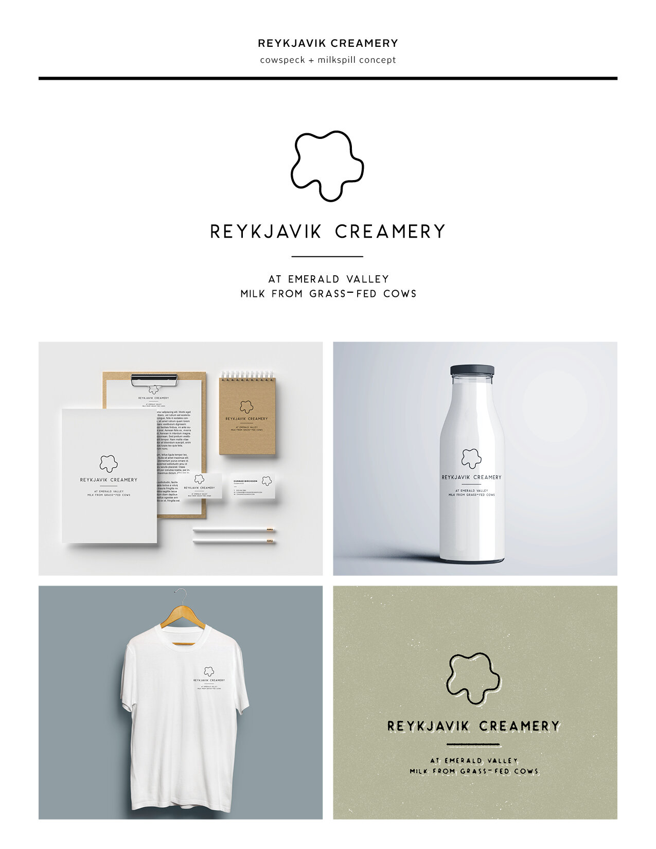
Once the initial phase was done, inspiration, fonts & imagery was pulled into Illustrator where I start playing around (see one of the inspo tiles above). Having a pretty good idea for 3 directions I’d like to present I gather them into a vision board. A super simple board where I give my concepts a name, I present the logo options and a few visuals to go with it. This is to show the potential of the logo, and if needed show variations of the logo (still only in a sketch phase).
vision boards
So, why three you might ask? Everyone has their own design process, but my reason is when presenting a logo, I like to think of my concepts like this: One direction with an icon, One with type only and the third something that is totally abstract & out there. This has proven a great way to show my clients the potential of their project. They might not even think that an icon would go with their concept, perhaps they are completely set on and icon and then rethink it when they see it set with a beautiful font or sometimes (and this has happened) they go for the one you took to the extreme, the one you’d love for them to pick but you’re pretty sure they won’t - haha!
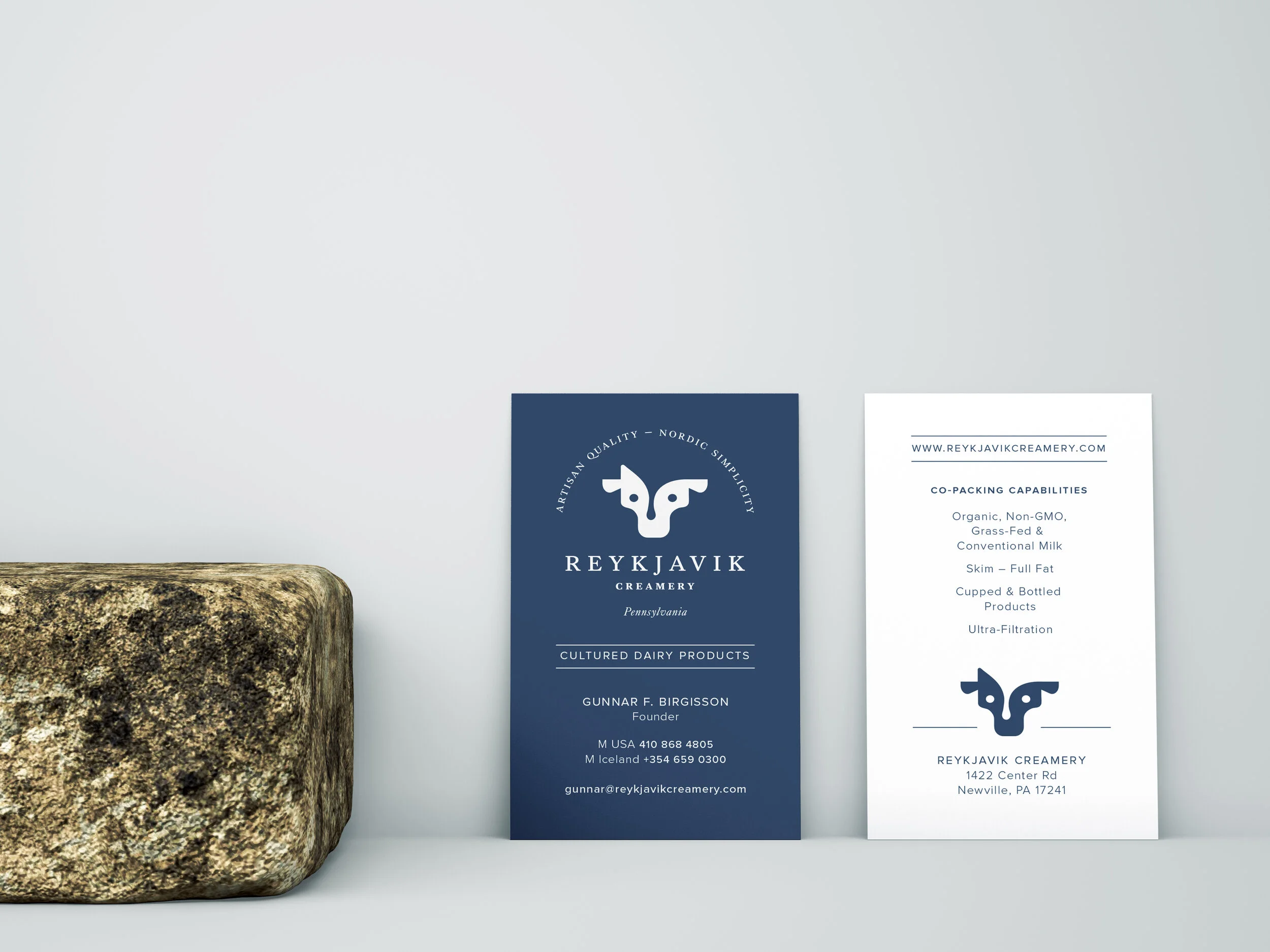
Once the client had reviewed all the options he came back wanting to work with the cow further, but felt it was a little bit too harsh looking! This was a great observation and on I went to create a “softer” cow and once the cow got a softer touch it was time to implement for their needs. With only the logo package the client got the final logo in a color of their choice, the logo in black and white as well as the icon (cow) in separate file to work with. With not a full branding package, as in we didn’t develop the brand around their logo, we did settle on a beautiful blue color to go with their logo as well as a set of nicely printed business cards.


